Client
Stand Contracting
Category
[Branding]
[Creative direction]
Year
08.2024
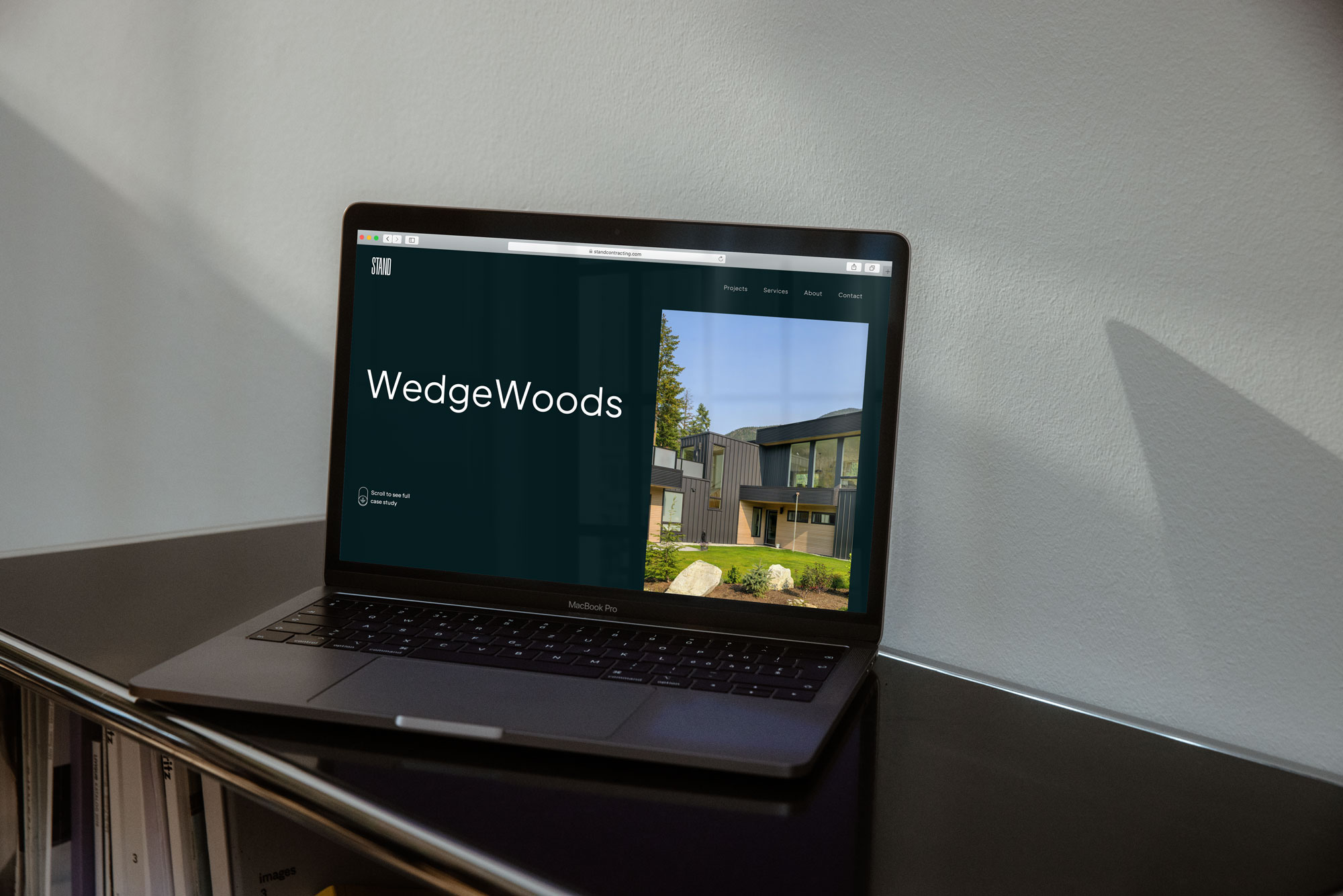
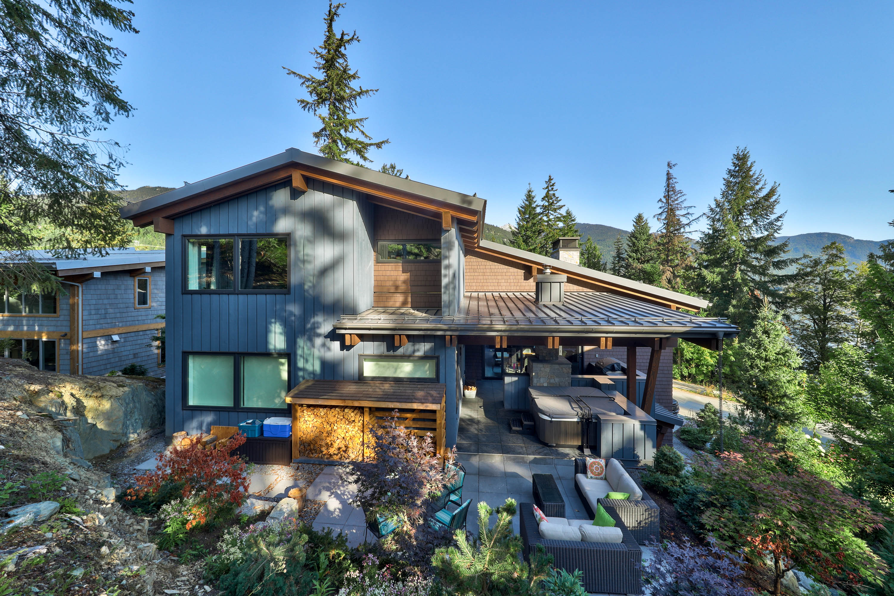

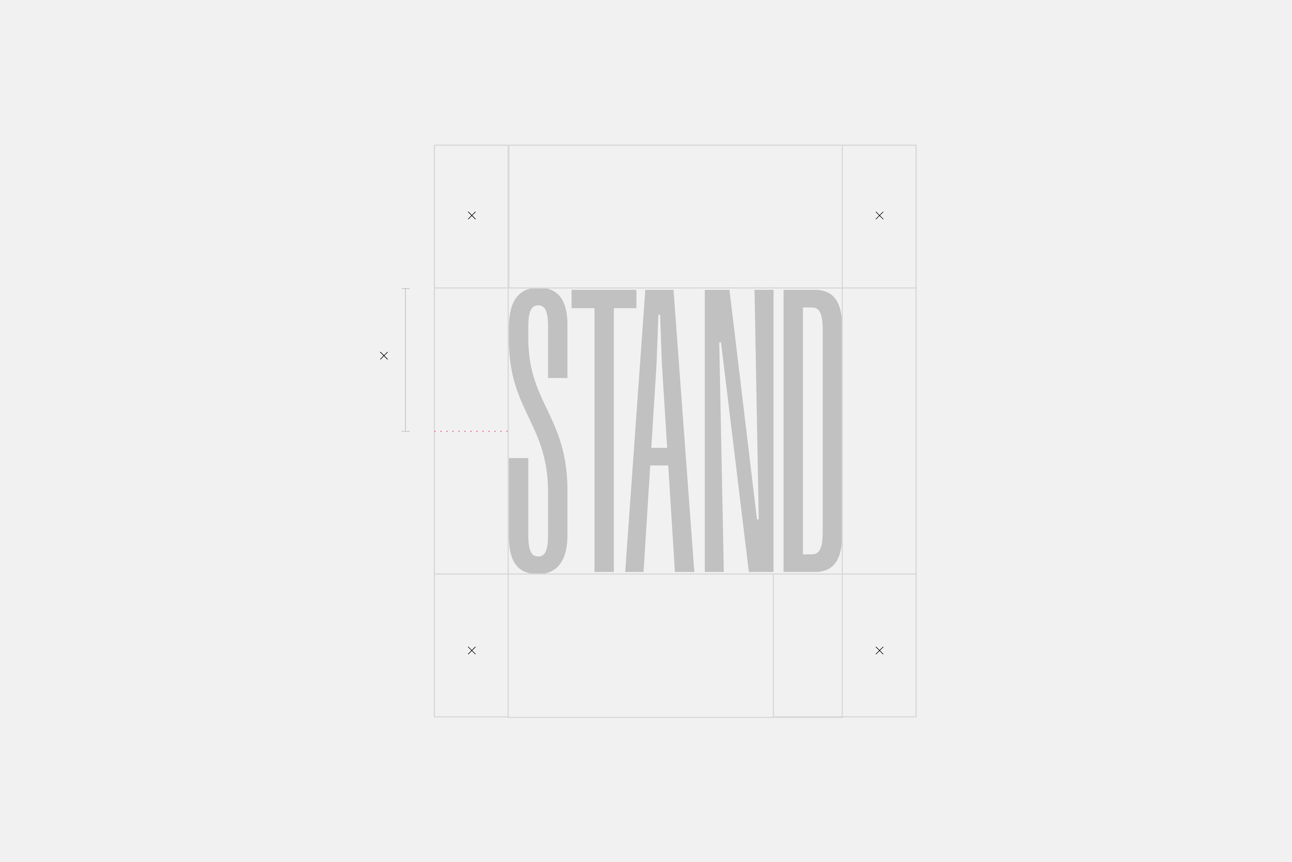
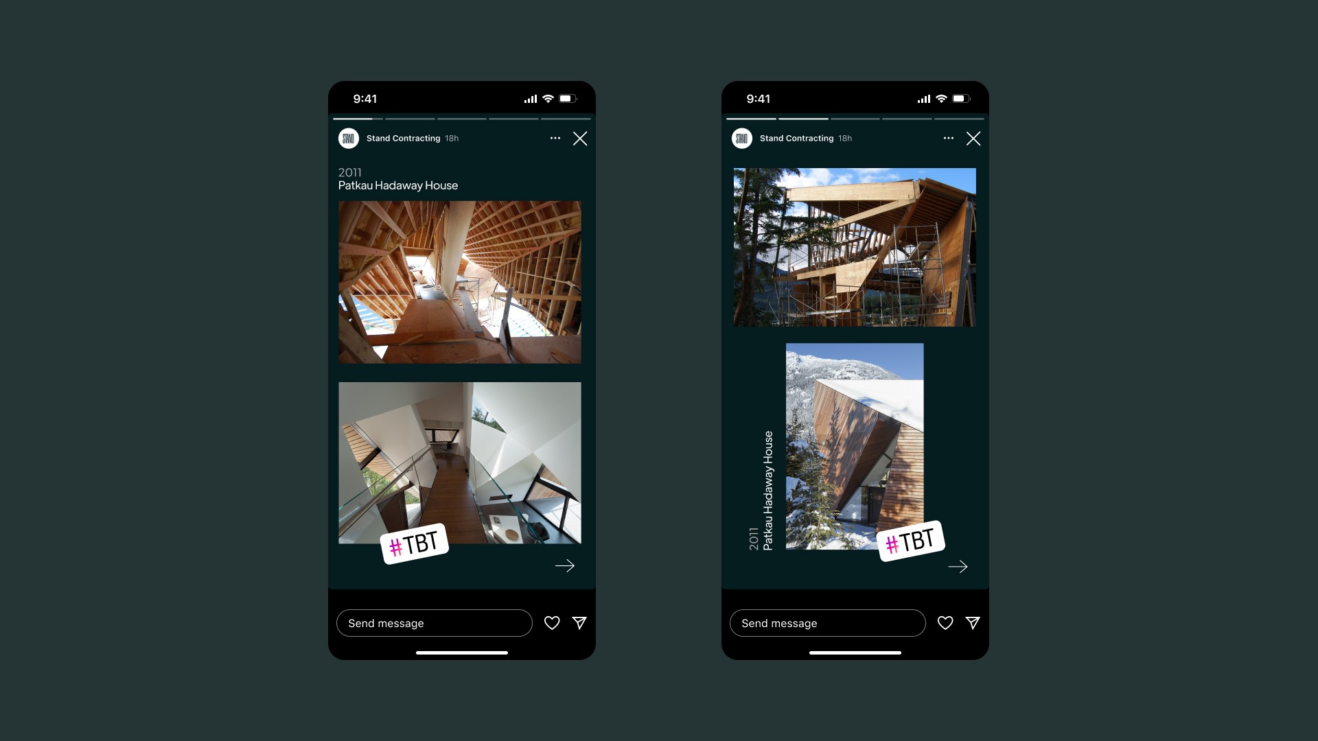
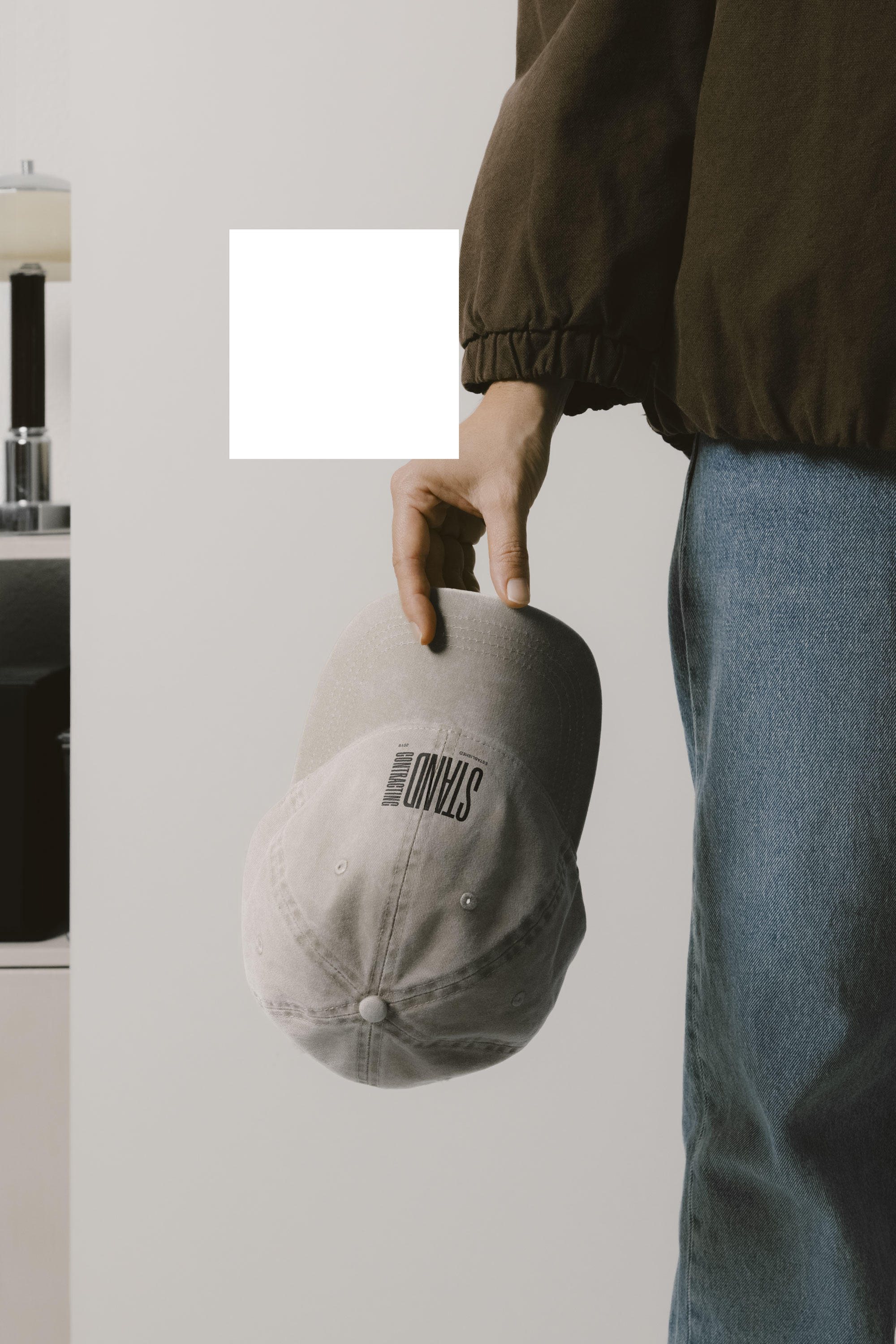
Branding and web presence for a custom home builder meant to attract top architects and potential clients. The tall, narrow custom typeface used in the logo emulates a cluster of trees, intentionally contrasting with the smaller x-height of the body font used throughout the marketing materials. Stand = a stand of trees, stand tall, stand for something.
Creative direction & design, Aubrey Emlyn